
Foreplay Game
<!--
Work info
-->
Client:
My Side Project
Role:
Product Designer & Developer
Year:
2025

Foreplay: Designing an App That Brings Couples Closer
Most apps are built to connect strangers. Foreplay was built to reconnect people who already know each other.
It's a card game app for couples — designed to spark conversations, create shared moments, and turn an ordinary evening into something memorable. The concept is simple. The design challenge wasn't.

Why This Project Exists
Long-term relationships don't fall apart because people stop caring. They drift because routines replace novelty. The same dinner spots, the same conversations, the same evenings.
Foreplay was built around one insight: couples need a low-stakes, playful way to break routine and discover new things about each other — without it feeling forced or awkward.
The result is a swipe-based card game with categories ranging from intimate questions to light dares — designed to feel like a natural part of a date night, not a therapeutic exercise.
📸 Image 1 — The Concept
A mood board showing the app's atmosphere — dark, warm, intimate. Candles, wine, soft lighting. Set the emotional context before showing any UI.
The Design Challenge
Building a couples app is a unique UX problem. The interface can't feel clinical or gamified in a cheap way. It needs to feel like an extension of the mood — something that fits naturally into a real evening between two people.
Three design constraints shaped every decision:
It had to feel premium, not gimmicky. The moment an app feels like a party game from a dollar store, the mood is gone. Every visual choice had to signal quality and intentionality.
It had to be frictionless in the moment. Nobody wants to navigate menus when they're mid-date. The interaction model had to be so simple that it disappeared — swipe right to complete, swipe left to skip.
It had to handle sensitive content with taste. Some of the card categories are provocative. The design had to make that feel exciting rather than uncomfortable — tone, typography, and colour all doing emotional work.
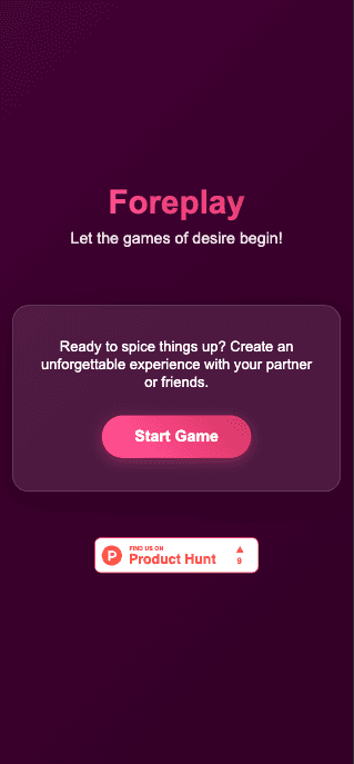
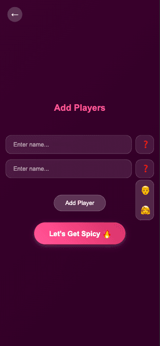
Onboarding Flow
Visual Design
The aesthetic direction was clear from day one: dark, sensual, sophisticated.
Colour palette — royal plum, wine berry, and midnight tones. Rich without being garish. Romantic without being cliché.
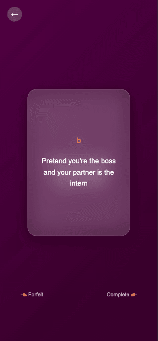
Glassmorphism cards — semi-transparent card surfaces with soft shadows create depth and a sense of physical presence. The cards feel like objects you're holding, not elements on a screen.
Typography — elegant, slightly editorial. The prompts needed to feel written, not generated. Font choices reinforced that handcrafted quality.
Swipe animations — folding card transitions with tactile feedback. The physicality of the interaction was important — each swipe needed to feel like turning a page, not tapping a button.
Core Card Experience
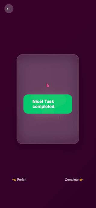
How It Works
Enter your names and choose your vibe
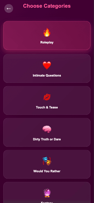
Pick categories — Roleplay, Dirty Truth or Dare, Slow Burn, Intimate Questions, and more
Swipe through glass-style cards
Swipe right to complete the challenge, left to skip
The structure is intentionally minimal. No points. No timers. No leaderboard. Just two people and a deck of cards designed to open conversations that don't usually happen.
Category Selection
What I Learned Designing This
Emotion is a design material. On most products I design, I'm solving for efficiency — how do users complete tasks faster. On Foreplay, I was solving for atmosphere. Every decision was filtered through: does this make the experience feel more intimate, or less?
Restraint is harder than elaboration. The temptation with a bold concept is to push the visuals to match. The better move was to let the content carry the energy and keep the UI calm, refined, and out of the way.
The best interactions are invisible. The swipe mechanic works because users don't think about it. They think about the card. That's the goal — design that serves the moment rather than announcing itself.
Reflection
Foreplay is a side project — but it pushed me to think about design differently than any client project has.
When the entire product experience is emotional rather than functional, the stakes for every visual and interaction decision are higher. There's no utility to fall back on. The design either creates the feeling or it doesn't.
It's the most fun I've had designing anything. And that energy shows in the product.
Foreplay — a card game for couples who want to explore, connect, and reignite the spark.
Designed by Amish Srivastava — UX & Product Designer amishsri.framer.website